In the previous blogs, we’ve looked at how we can design your website such that search engines like it. However, for whom else must we perfect the design of your website? Yes, you’ve guessed it – your human viewers. They’re just as important, so in this blog we’ll start to look at what we can do to make it more appealing for them.
Hans Hoffman, a German-born American painter, considered to have both preceded and influenced Abstract Expressionism (I must admit, I don’t really know what that is myself) said, “the ability to simplify means to eliminate the unnecessary so that the necessary may speak.”
You may be asking, ‘so what does this have to do with website design?’. Well, the answer is rather a lot. To properly answer the question though, we’ll first look at what simplicity in the design of any website is, how we can incorporate it into our designs and just how effective it really is.
What is Simplicity in Website Design?
People often think that to make an effective website, it needs to have lots of cool and interesting features, a bit like the latest mobile phones, or new cars with knobs where you’ve no earthly idea what they do. I can tell you now, that’s wrong. The simpler the better. At the really basic level, simplicity is simply (do you get what I did there…?) the removal of all unnecessary features or elements of a design. The more variations and features you have in the design of a website, the more confusing it gets for the viewer and the more likely your message is to be lost.
As Hans Hoffman said, you want the ‘necessary’ to speak. For each and every one of you who has created, or is thinking of creating a website, it has a purpose. Whether you’re a shop owner looking to sell your products online, you’re a charity looking to attract donors and volunteers, or anything in between, you don’t want the message to be lost. After all, the website isn’t free, so you want to get the most out of it, for what you’ve paid. That’s why you need to make sure the website is as simple as possible.
How can we Achieve Simplicity in a Website Design?
To achieve a simple design, you’re looking for a clean, carefully coordinated layout, with a very simple colour scheme and lots of white space. A clean layout only ever has a few key features, whilst it more often than not relies on the colour scheme and white space to grab the interest of the viewer.
Colour Scheme
Thinking about the colour scheme, in order to minimise the complexity and increase the effectiveness, allowing your message to shine through, you want to limit the number of different colours to two or three, maximum. Take a look at this, from the home page of my own website.
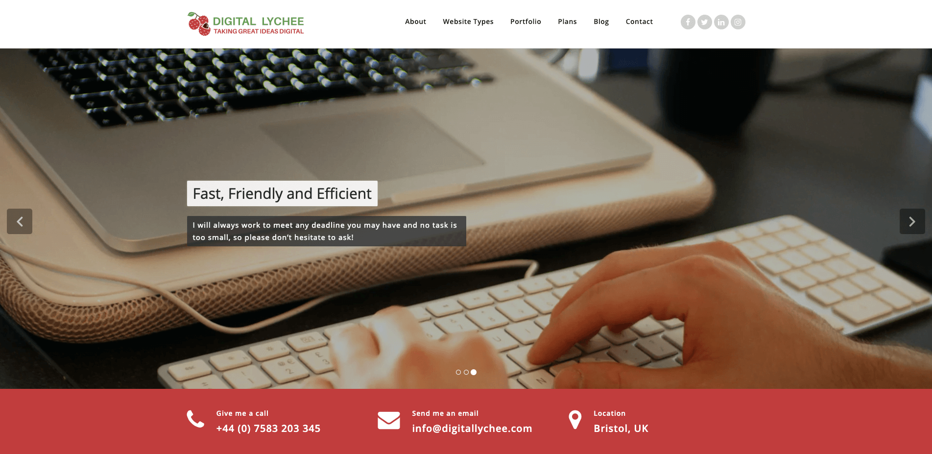
You can pick out three key colours. The first is the red variation, the next is the green in the logo and finally the white. Aside from some grey text in the navigation bar, that’s all you’ll see and that’s really all you need for a simple, yet effective colour scheme. To really grab your viewers’ attention, the colours should be uniform across the website and should match the logo, to make it clear where they came from.
White Space
Finally, you want to make sure that your website has lots of white space. Now, I hear what you’re thinking – ‘what if I don’t want any white on my website?’. Well, don’t worry. White space doesn’t actually mean you must include the colour white. Also known as ‘negative space’, white space is simply a relative expanse of the background colour of the website. Whether it’s white, grey, blue, green or anything else, you just need to have enough of it. You might want to make sure each page of your website has lots of different features but remember, the more ‘white space’ each web page has, the more attractive it is to your viewers and therefore the more effective it is.
How Effective is a Simple Design?
The short answer is ‘very’. To elaborate on that, to understand just how effective it is, we’ll look at three different attributes: legibility, first impressions and website updates.
Legibility
First, let’s take legibility. Have you ever been on a website where there’s so much text, it’s so small and squashed together? Take a look at the image below, which is an example of that.
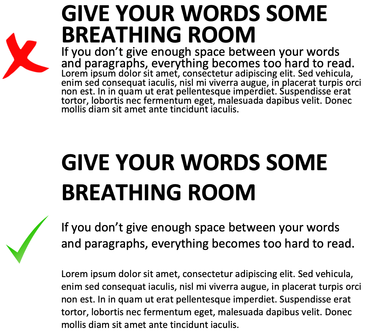
At the top, you’ve got some text that is squashed and very hard to read, whilst at the bottom you’ve got the exact opposite. The white space between paragraphs and lines within paragraphs make content much easier to read and can actually help guide readers to the most important feature of the page on your website. They act as a very subtle highlight, without those annoying fluorescent colours, making it very easy for your viewers to scan your website to find the exact information they need, quickly.
First Impressions
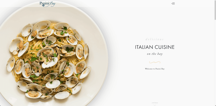
Next, white space will also drastically improve the first impressions of visitors to your website. In a world where people often view websites on mobile devices on the go, without much time to spare, a design that helps someone get to the point quickly is always much appreciated. Also, you’ll find that a cheap, poorly designed website will try to make a ‘hard sell’ by cramming as much information as possible into it. Contrary to that, a simple design suggests that whatever the purpose of the website, it is so upmarket that it doesn’t need to work hard to convince the viewer of its luxury. Take a look at these designs below, which illustrate this perfectly. The first website is called ‘Arngren’, which is a Norwegian technology and gadgets sales website. The second is from an Italian restaurant called Panini Bay, in the United States.
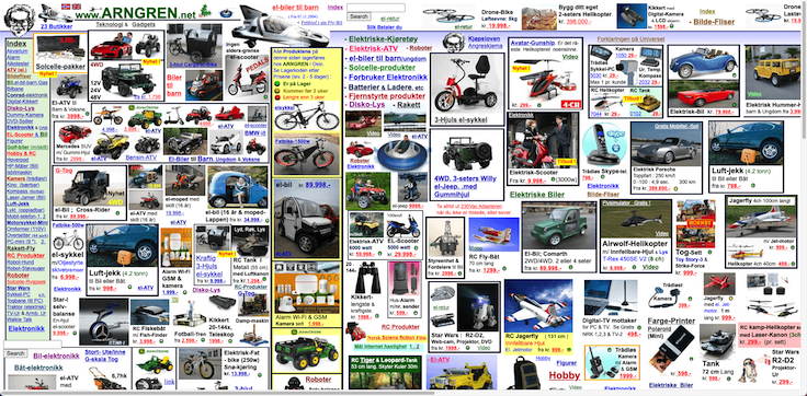
Do you notice what’s wrong with the first website? No? Well, I’ll tell you. Whilst I admit I can’t speak Norwegian and I have absolutely no clue what any of the website says, the design is nothing short of horrific. There’s so much crammed into it, with no order or white space whatsoever. If you look, there’s a horizontal scroll bar at the bottom, which means the website isn’t even at the very least responsive. There’s so much content on this home page that it overflows and you’d end up spending so much time on the site just trying to decipher things. Who knows, maybe that’s what the designer was going for. Whatever the reason, make sure your website never looks like this, I implore you.
On the other hand, aside from the fact that I do love a good Italian meal, the Panini Bay website is so beautiful and simple, that it immediately suggests a high quality. The simple, high quality design of the site makes it really easy to read and immediately gives you the impression of a top-quality restaurant where you won’t be disappointed. This is the sort of website you should bear in mind when designing yours, if you want to attract visitors and give the impression of quality.
Keeping your Website Updated
Finally, although you might not realise it, a simple website is actually much easier to amend and update. There’s no overcrowding or repetition, drastically reducing the number of things that would need to be changed when the design is updated. Whoever you are and whatever the purpose of your website, you always want to make sure that your website is simple, thus reducing the time and cost it takes to maintain and upgrade it. As Benjamin Franklin, one of the Founding Fathers of the United States, famously said, ‘remember that time is money’.
How will Digital Lychee Help You?
At Digital Lychee, I understand what it takes to make a simple, yet effective website design that suits your needs perfectly. If you’re going for a budget-friendly template website, I’ll find the perfect theme for you, that you can be proud of. If you’re going for a unique, custom website, I’ll make sure my design for you is just right and I’ll create a mockup of the website before it is made, so you can be sure you’ll love it when it is finished. Get in touch now to find out more and to start your digital journey.
