Information is all around us. There’s no escaping it. On a daily basis, you’re exposed to it from so many sources, whether it’s social media, newspapers, books, blogs, films or anything else. Can you guess what they all have in common though? Well, I’ll tell you. It’s the text. It is a fantastic opportunity to really ‘make a statement’ and grab your viewers’ attention. That’s why, in this article, we will take a look at how typography matters and how you can put it to good use in your web design project.
What’s the Psychology Behind it, for the Viewer?
Typography, which simply means the style and appearance of the text, has a major effect on how your viewers perceive your website. It can help develop a hierarchy, so the viewer can decipher sections, whilst emphasising key text, drawing those viewers to the most important information. Take a look at the Kolenda Font Model below, which comes from Nick Kolenda.
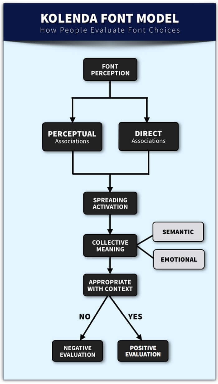
You may think that choosing a font for your website is easy and that you can do it last but in reality, you shouldn’t. It is natural for viewers to make passive mental associations between the font they see on your website and their own experiences. The viewer will expect certain types of websites to look a certain way and if there are deviations from those expectations, they can negatively evaluate your website. A good example of this is The Telegraph (UK) online newspaper. Their headlines use a serif font type called ‘Austin News Headline’. It has similarities to Times New Roman and is the sort of serif font typically used with high-quality printed newspapers. Psychologically, that’s very important in reassuring viewers of the quality of the now online content. Anything else would have had a negative effect.
What are the Important Things to Consider?
In this article, I’m going to take you through a few things you should consider. If you use my suggestions, you’ll be able to make your content much more readable, improving the user experience and therefore increasing traffic to your website.
Size Really Does Matter
As we’ve discussed, the purpose of typography is to make your website text much more readable. Therefore, the size of the text is important. You can use it to place emphasis on certain areas of your website. The greater the size of a particular part of the text, the more easily a viewer is drawn to it and therefore the greater the perceived importance to the reader. Take a look at this screenshot from the Bootstrap homepage:
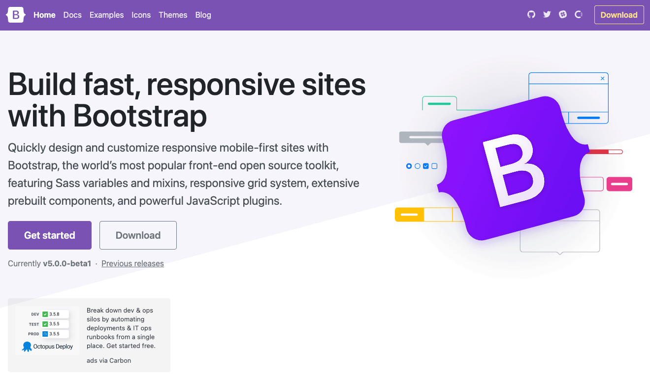
You can quite clearly see the title/strapline with a larger font size, with the size shrinking as you move further down the page. That’s the emphasis and visual hierarchy I have been talking about. Any viewer’s mind will naturally scan a website to gravitate towards the elements that stand out more. That’s one of the key reasons why in modern websites, you will see landing or homepages with large text overlaid on hero images.
Width is Just as Important
Have you ever noticed that a lot of websites nowadays have a lot of white space around the text, such that the paragraphs of text are much narrower than the available space? There’s a very good reason for that. The longer the line length, the harder it is for users to read quickly and without any confusion, since longer lines can distract the user and decrease legibility. Depending on the type of reader (novice, expert etc.) the optimum line length can be anywhere between 40 – 80 characters, the extremities of which are demonstrated by this image from Wikipedia:
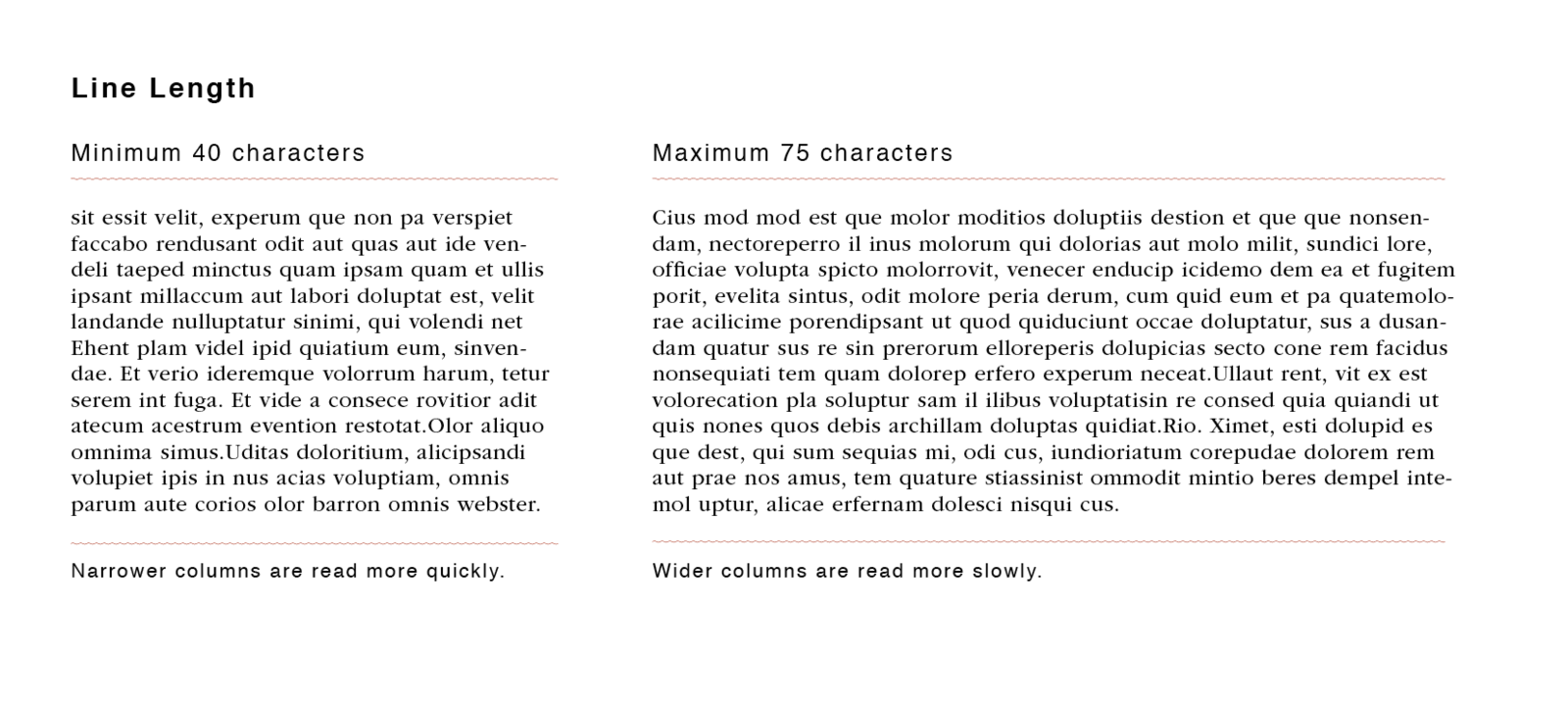
These numbers can again vary between device sizes. For example, on most mobiles, you should avoid including more than 40 characters in a line and that increases to 60 on tablets. If you stick within these guidelines for your website, then you won’t go far wrong. You can, of course, have lines of text that are longer than this, provided you have maintained enough white space either side of the text and even between the lines, to improve legibility, as I have done with my own blogs. If you want to read about this in a little more depth, you should take a look at this great article, from the UK research group Baymard Institute.
Give your Characters Breathing Room
Whilst giving characters on stage or film breathing room is important, giving written characters space is just as important. All you need to ask yourself is ‘do I want my viewers to be able to read what I have written?’. If the answer is yes, which I hope it is, then you need to ensure that your characters and words are well spaced out. Take a look at the two examples below:
Which one of these do you think is the easiest to read? If you think the first one is, great. If you think the second one is, think again. The purpose of this is to emphasise that you do not want your readers to have to work too hard to understand the text you have written. If they do, they won’t pay attention to the meaning, or function. If they can read it easily, then you’ll be able to get your message across to them without losing their interest.
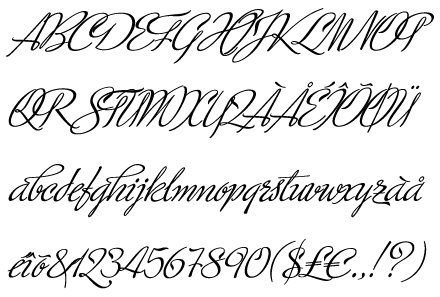
Some of the most popular typefaces, according to TypeWolf are Apercu, Futura and Proxima Nova. If you use these for your website, or ones similar to these, then you won’t go far wrong.
Quality Over Quantity
You may find yourself tempted to try and ‘spice things up’ a bit by introducing lots of different typefaces to your website. Perhaps you’re using different ones for different sections, or in an attempt to draw attention to specific parts of your website. However, you shouldn’t do that. The optimum number of different typefaces you should include is somewhere between 2-4. You’re aiming for balance and consistency in your design, whilst making your text attractive for the reader. Take a look at the image below, which is a screenshot of ‘The Legal Way’ theme from Template Monster:
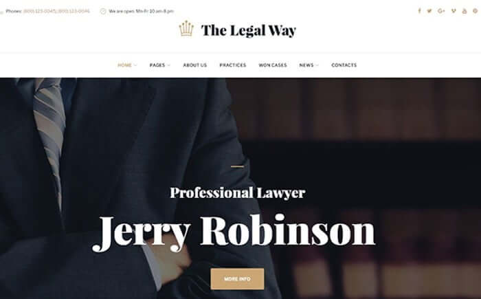
What I hope you’ve noticed is that the large title text overlaying the hero image has been chosen to be serif, which gives a professional, up-market appearance that would be expected of a lawyer. In contrast to that, the navigation menu uses a smaller, sans-serif font. Your attention is instantly drawn to the header section with the large font and the navigation section uses the sans-serif font, since sans-serif fonts are easier to read than serif ones when the size of the text is smaller. That’s the level of thinking you should give to the typefaces you use on your website. They shouldn’t be an afterthought, which happens all too often.
Don’t Forget About Alignment
How easy do you think it would be to read a piece of text where the writer completely forgot to bother with alignment? Well, you can give it a go now. Take a look at the image below, which was taken from exSite Communications.
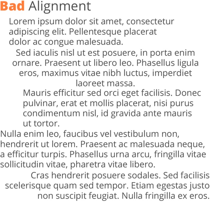
It’s not particularly easy to read, is it? That’s because text with a purposeful alignment (usually to the left or justified) is much more aesthetically pleasing than one which is all over the place. If you were to leave the text on your website as scattered as that in the image, the only thing you’re achieving is giving your viewers the impression that your website/text purpose is as useless as your alignment, putting them off.
As the majority of us tend to read from left to right, that’s the most common type of alignment you’ll see on websites. It makes sense. Sometimes there are exceptions. For example, you’ll see right alignment when the designer is trying to draw attention to something, or justified font often in newspapers and the media. The only problem with justified font is that it can often leave large gaps between words, which is ugly. That’s why it tends to be limited to newspapers, where the columns are quite narrow.
How can Digital Lychee Help You?
I hope you have found this article interesting and insightful. If you’re looking simply for some advice about the design of your current website, or you are looking for someone to help create you a fantastic website, then I am the web designer for you. I would love to hear from you. You can get in touch with me here.
