What's the Situation?
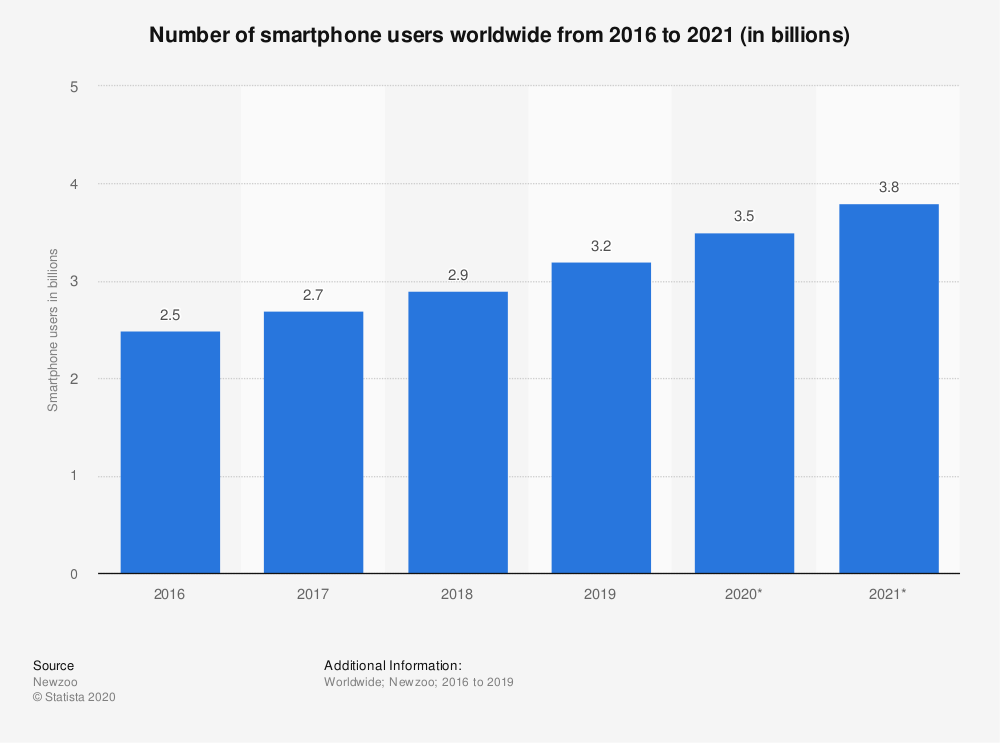
In an increasingly digital world, smartphone usage continues to rise. According to Statista, there are likely to have been 3.5 billion smartphone users in 2020, projected to rise to 3.8 billion in 2021.
According to Oberlo, 48.62% of all global website traffic in 2020 was from mobile devices, which is a huge proportion. Clearly, it is very important to make sure that your website is mobile-friendly, if you want to have a healthy slice of that global mobile website traffic. It’s one of the main reasons why search engines such as Google, Bing and Yahoo include mobile friendliness in their search ranking algorithms. That means, if your website isn’t mobile friendly, you’ll take a definite hit in your search engine performance rankings, which of course isn’t what you want at all. That leads onto the question, what is mobile friendly design?
What is Mobile Friendly Design?
To put it simply, mobile friendly design means that all your website’s information, which includes text, images and videos, is readily and easily readable no matter what platform it is being viewed on, from the largest desktops to the smallest mobile devices. In particular, it must be easily readable on mobile devices. Take a look at the example below.
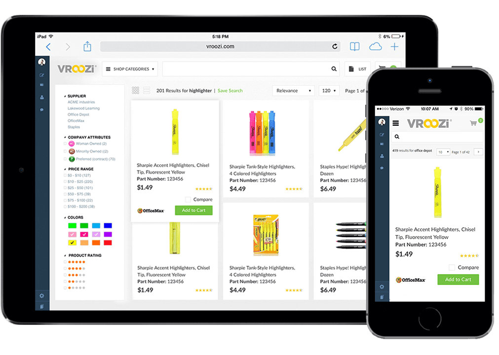
This image, of Vroozi Mobile Procurement Marketplace’ website, is taken from Wikipedia. What’s important to note is that when the same website is viewed on the small smartphone, compared to the large tablet, the website layout changes. Instead of squashing everything onto the screen in the same arrangement, the website has rearranged on the smartphone, to hide the filter menu by default and to arrange the product tiles vertically, making the information much more readable.
When any website is being designed for the small screen, there are three key aspects to keep in mind:
- There is minimal space available
- The viewer’s attention is much more scarce
- A mobile user typically has something specific they are after, rather than simply ‘surfing the internet’
Hence, if a design is to be mobile friendly, it needs to be as simple as possible. Search engines such as Google are increasingly demanding that websites are increasingly suitable for the mobile user. There are three key things that they stipulate as being a killer to your search rankings in terms of mobile friendliness:
- Text or images that are indecipherable without scrolling or zooming
- Tap-able areas that are too close together
- Content that cannot be played
Google itself suggests that the single “most easy, efficient and cost-effective solution to achieve mobile friendliness is responsive web design (RWD).” However, is that the only way? Well, let’s find out.
How Can we Achieve a Mobile Friendly Design?
The answer is, in a couple of ways. Firstly, as I’ve mentioned, Google suggests responsive web design is the best way of achieving this. A responsive website is one that will ‘respond’ to the size of the browser at any given point, no matter what the browser width is, adjusting its layout and functionality to match. Is the browser 200px wide or is it 20000px wide? It really doesn’t matter, as the layout will respond accordingly.
The alternative is known as adaptive website design (AWD). This is similar in philosophy to a responsive website, in that it looks to change the layout and functionality according to the size of the browser window. However, where a responsive website will smoothly change its layout pixel by pixel, an adaptive design will only change its layout at certain browser widths. For example, if you started on a browser that was greater than 1280px wide (a typical design breakpoint) then the website would take on a certain layout. As you shrink the browser window, reducing its width, the layout will remain exactly the same until the next breakpoint (which could be something like 980px wide). That means the layout will be slightly squashed, until the breakpoint is reached, at which point the layout will change again, to be more user-friendly.
Take a look at the two examples below. Both are demos designed by CSS Tricks on CodePen, which is a code hosting website. The first example demonstrates a responsive container to you, whilst the second demonstrates an adaptive container.
What I presume you’ve seen is that as you shrink the window, the responsive container adapts smoothly as you go, so it always fills the appropriate width. On the other hand, the adaptive container in the second demo changes ‘suddenly’ at a specific breakpoint and everything squashes until that breakpoint is reached. That’s the difference between the two of them.
So, which is Best for my Website?
The answer is, there is no right answer. Helpful, right? Essentially, they are two different strategies to achieve the same end goal and you must simply choose the one that best suits the project at hand. If, for example, you are building a website and you know there are specific devices you are targeting, then adaptive design may be for you. It is quick and easy to make sure the design will fit those specific devices, with adaptive design.
On the other hand, if you want your website to look perfect on all devices and you also want to future-proof it against an as yet un-invented device with a very odd size, then responsive design is the way to go.
How will Digital Lychee Help You?
At Digital Lychee, I know you want to have a website that you’re proud of and that looks fantastic, no matter how the user is viewing it. As a result, all websites that I design for my clients are mobile friendly, so you don’t have to worry. When we have our free, no-obligation initial online consultation, we’ll go through everything, so you can be sure you are getting the perfect website for your needs, no matter what the purpose is. Get in touch now to find out more and to start your digital journey.
 Manual 5.0
