As a website owner, you will want to make sure that your website is as accessible to as many people as possible. In previous blog posts, we have covered quite a number of ways in which you can do that, from search engine optimisation, to TLDs, social media links and everything in between.
In reality, this isn’t enough. Accessibility isn’t just about your website being found and loaded. Globally, there are millions of users who have conditions affecting their ability to use many websites. To make yours a truly accessible and successful website, you will need to take this into account. That is why, in this instalment, we will look at the sorts of issues that could prevent someone using your website and some ways you can sort this. Let’s get started!
Why Should You Go the Extra Mile to Make your Website Accessible?
Website accessibility isn’t just about making sure it loads in a viewer’s web browser. It goes far beyond that. The reality is that there are millions of users across the world who have a range of special needs or impairments making it difficult for them, or in some cases impossible, to access a website. These could be anything from visual and hearing impairments, to cognitive disabilities (such as dyslexia) or motor skills/physical disabilities, which could mean a user might struggle to do basic things, like clicking a mouse. To get round these issues, many users will use a range of assistive technologies, including:
- Screen readers, to convert text on a page into audio.
- Speech recognition software, to convert any audio into text.
- Braille terminals, to allow deafblind users to understand websites.
- Alternative keyboards, to accommodate special needs users.
These technologies, which are becoming more sophisticated with every year that passes, are enabling millions more to browse websites. Making your website more accessible will allow you to expand your potential audience and attract many more visitors. After all, that’s what you want to happen when you set up a website, right?
Read on to discover some suggestions as to how you might make your website more accessible to users with disabilities, impairments, or special needs.
How can You Make your Website More Accessible?
We’ve seen why it is important to make your website more accessible. Now, let’s look at how. Here, I have put together a list of ten different ideas, which you should find useful to increase your website’s accessibility. In reality there are many more things you can do, but if you follow these, you’re off to a great start. Happy reading!
#1: Ensure your Website is Keyboard Friendly
Although you may not realise it, many assistive technologies rely on the use of the keyboard only, to help the user navigate. That’s why this step is incredibly important. It should be possible for any user to navigate through your website without ever touching the mouse. The most common way of doing this is through the Tab key. Take a look at the image below.
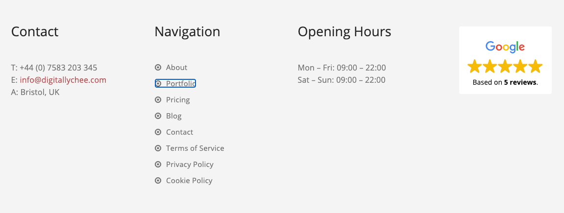
You’ll see that in my website footer, one item is currently ‘in focus’ and that is the link to my Portfolio page. When a user navigates with the tab button, each time it is clicked, the browser will switch its focus to the next clickable link (or button, form etc.). Once in focus, the user simply has to click ‘Enter’ to use that link.
This is a very easy accessibility feature to test, although it is also very easy to forget! If, when you’re ‘tabbing’ through your website and some links or important features don’t come into focus, you’ll need to sort that. If you need any advice with this, WebAIM has put together a very handy guide for keyboard-accessible website design.
#2: Ensure your Website Content is Easily Accessible
Most screen readers used by visually impaired visitors will only read the website in its initially loaded state. That’s fine if your website only has static content. However, if your website has some dynamic content, which is any content that can change without needing to reload a page, such as a slider or carousel, this can be a bit of an issue.
The best way to ensure that your website is accessible, even with dynamic content, is to use ARIA landmarks, which are specific tags you add into the code of your website for each section, to give it a clear definition to any screen reader. For example, you could set a slider to be a ‘live region’, which would essentially tell the software that this content does change, allowing it to interpret all variations of the content, as it changes. If you are using WordPress for your website, their accessibility team has put together an ARIA landmarks guide specifically for the platform, which you can view here.
#3: Add ALT Text to all your Images
Put simply, ALT text is a short description (usually 125 characters or fewer) given to any image on a website, that is displayed by a browser if the image cannot be displayed, for whatever reason. If you include this for your website’s images, a screen reader will then be able to interpret those images and describe them to a visually impaired user. As a rather valuable side bonus, adding ALT text to your images will improve your website’s SEO performance, as you’re giving search engines more information about your content. Provided your ALT text includes useful keywords, without them being overused, you’ll find this does help your search performance.
Different platforms will allow you to add ALT text to your images in different ways, including WordPress, Squarespace, or Joomla. Whichever platform you are using, make sure you add ALT text to your images, to improve its accessibility and to boost your search engine performance.
#4: Choose the Right Colour Scheme
In a previous instalment, I talked you through choosing the right colour scheme for your website. There is one key area we need to focus on here: contrast. You simply need to ensure that there is enough contrast between your text and background colouring, so that it can be read by anyone, including those who are colour blind. Typically, you will have a very light background with dark-coloured text. White and grey/black are very common, but you don’t have to stick to just that. Take a look at this image, which comes from a Lifewire article on colour contrast.
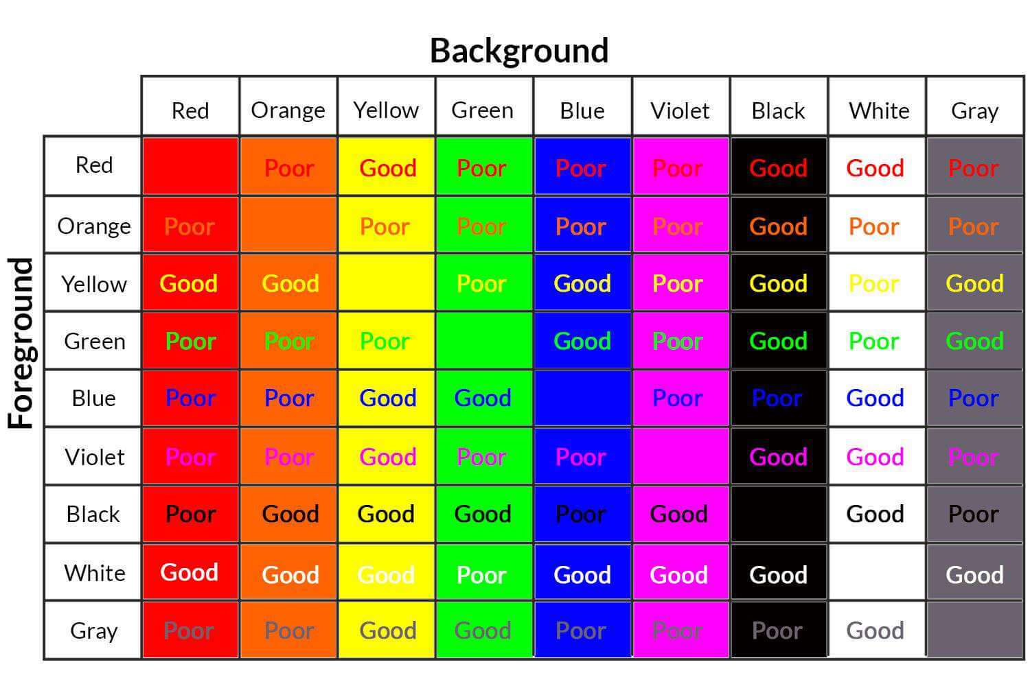
The general rule of thumb is to ensure that you use a lighter background colour and darker text. However, if you choose to use a different background colour, you can see quite clearly which colours should be paired together and which shouldn’t, for greater accessibility.
#5: Use Headers to Properly Structure your Content
Structuring your website with clear header and paragraph text has multiple benefits. For the average visitor, it just helps them to understand what is going on a bit more, helping them to digest the content and improving the flow. It will also help the screen readers of your more visually impaired users to interpret your website much more easily.
The basic idea is that the largest (H1) header size should be used for the title only and all subsequent headers should be smaller, according to whether they are sub-sections (H2), sub-sections of those sub-sections (H3) and so on. Here’s a fantastic article from Nomensa which goes into a lot more detail about this.
#6: Design any Forms for Accessibility
Depending on the purpose of your website, you may or may not actually have a form. For example, if it is purely information-based, such as an encyclopaedia, then you may not have one. However, if you are running a business, organisation, charity or anything like that, you’ll almost certainly have one, to allow people to get in touch with you.
To make your forms accessible, there are only two key things you need to do. The first is to ensure all fields in your form have a title, or description, such as ‘Name’, ‘Subject’ or ‘Message’. The second is to ensure that there are some instructions supporting the contact form, to make it clearer what needs to be done and where.
If you manage to do all of these things on your website forms, then that would be sufficient to ensure they are accessible to all your visitors.
#7: Avoid Tables, except for Tabulated Data
Tables are great, aren’t they? Not only can you use them to eat your dinner (sorry, I had to do that!) but you can also use them to display information on your website, such as a price list or other data. They are really handy. The only problem is, they are very confusing to screen readers.
That’s why you should limit when you use tables on your website. For example, you should use them for tabulated data, like prices, but nothing else, including lists. If you do need to use a table on your website, you should ensure that your labelling is as clear as possible. If you need to build a particularly complex table for your website, that’s okay, provided you have followed the advice set out by W3, here.
#8: Enable Resizable Text
For users who are visually impaired, they may often want to enlarge the text on your website, helping them to read things better, a bit like those landline phones or keyboards with particularly large numbers and letters. You should always ensure that this is possible on your website. An easy way to do this is to ensure your website font size it set using a relative unit, rather than pixels. Here’s a guide from WebAIM, which explains this in more detail. This means that you shouldn’t suffer any loss of clarity of your text, if someone zooms in, to help them read better.
The WordPress platform provides other ways to do this, through plugins. For example, take a look at the image below, which is a screenshot taken from a website I recently completed for a client.
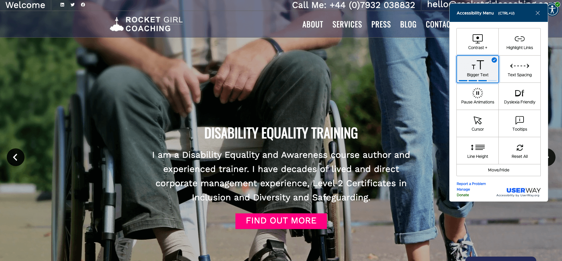
You can see that the widget, in this case UserWay, has allowed me to increase the size of all text elements on the web page, to make them much more readable. The plugin also allows the user to do many more things, including increasing contrast, increasing text spacing and making it more dyslexia friendly.
#9: Avoid Media that Plays Automatically
Don’t you find it annoying when you’re scrolling through a website, or even your Facebook feed, when things like videos just start playing automatically? Well, you’re not alone. Globally, people find that frustrating.
When you are a fully able-bodied user, it’s fairly easy to just stop the video playing. However, for those reliant on-screen readers or similar technologies, then this is no simple task. Even if a user is able to switch it off, it is very possible that the automatic playing, sometimes when the video isn’t even in view, could frighten or confuse a viewer.
The answer to this is very simple: avoid all automatically playing media.
#10: Design all your Content to be Accessible
Up to this point, we have looked at lots of things we can do to the style or functionality of the website, to make it more accessible, but what about something even more fundamental – the content?
Well, it is fairly simple to ensure that your content itself is accessible. For example, whenever you have an acronym, make sure it is spelt out it full. Also, ensure no two links or buttons share the same title, to avoid confusion. There are many more things I could suggest, to help you improve the accessibility of your website content. However, I am sure you get the gist.
The Upshot
The accessibility of your website is very important, yet it is overlooked far too often when it comes to website design. Since there are millions of users across the world who need to use special technologies to help them view websites, you need to make sure yours works for them.
You can do this by many different means, including adding ALT text to your images, choosing the right colour scheme and using headers to properly structure your content. Whether you choose to do all of these or only some (or none of course) the most important message I can leave you with is that you must always keep your audience in mind. If you target audience is likely to be made up of those who would be using assistive technologies, then making your website accessible is a must and not just a nice extra feature.
How will Digital Lychee Help You?
At Digital Lychee, I make sure that I tailor all my clients’ websites to suit their individual needs. In your initial consultation (free and no obligation, of course) we will discuss your needs in full and I can advise you on the steps you should take to make your website accessible, if necessary. If you are interested in my services, or you want to find out more about my blog, I would love to hear from you. You can get in touch with me here.
