Just like when you’re choosing what colour car you want or what colour to decorate your walls, choosing the right colour scheme for your website is equally as important. You may ask, why? Well, research shows that 62-90% of snap purchase decisions are driven purely by the perception of colours. In addition, the average user has an attention span of only 8 seconds.
That’s nothing, I hear you say. Well, you’d be right. It is nothing. However, what it does mean is that first impressions really do count. You only have 8 seconds to convince your visitors that your website is memorable, trustworthy, attractive and profitable. The colour scheme is one of the first things a visitor will see.
To that end and since different colours can denote different things about your website to visitors, then I have put together a list of 6 different steps you should consider when putting together the colour scheme for your website. You don’t have to follow everything to the letter but if you stick to them, you will definitely have a successful colour scheme for your website.
Choose your Primary Colour
A primary colour is the main theme colour running through your website and therefore it is very important to get it right. You’ll want to stick with it, since changing it regularly can signal to potential visitors that you’re not right for them, especially as you can’t build up any sort of brand identity.
There’s a high chance that you already know your primary colour, or where to find it. If you have a pre-existing logo, then you’ll want to make sure it comes from that logo. You’ll see an example of that in my own website. The primary colour, a burgundy, comes from the skin of the lychee in my logo. If you have a picture that represents you or your business/organisation well, you may want to use that to select your colours. You can quite easily generate a colour palette from an image using a tool like Canva or even simpler, using an extension for Google Chrome or Firefox such as ColorZilla, which lets you identify single colours from an image with just the click of your mouse button.
Right now, you may be asking ‘what if I don’t have a logo or image?’. Well, I have the answer for you. You can use a quiz such as this one from Grasshopper, to help decide what colour your branding should be. If you want to go further, you can take inspiration from websites such as Dribbble or Behance. Either way, happy primary colour hunting!
Decide on the Number of Colours You’ll Have
As you’ve seen from the first point, you need to pick your primary colour first. That’s the colour off which all the others are based. From there, you need to decide how many other colours you’ll be adding to your palette.
Typically, you’ll want to add a maximum of two more colours to the palette, to have a total of three across your website. There’s an old designers rule, known as the 60-30-10 rule, which is based off the inclusion of three colours in your palette. This advises us not to use equal amounts of the selected colours. Instead, you should split them into percentages, using one of them 60% of the time, the next 30% of the time and so on. My own website uses this philosophy, where the title banners, in-text links and hover colours etc. are burgundy, whilst the other colours are woven into the design, but in smaller amounts.
You may be asking, that’s great, but how do I select the other colours? Well, you could use something known as a Triadic colour scheme. That’s based off selecting three colours that are equally spaced around a colour wheel, using one colour as the dominant primary colour and the other two as accents.
Pick Effective Secondary Colours, Only when Needed
By now, you know we’ve seen that we should always select a primary colour and then a maximum of two others for your website. So why are we now talking about secondary colours, which are bound to take us over the recommended three-colour limit? Well, the answer is very simple. When you’ve got a big website with lots of different features, such as landing pages, products, sidebars, buttons and other elements, it is important to have the ability to differentiate between these, to improve your conversion rate and improve the experience of visitors to your site.
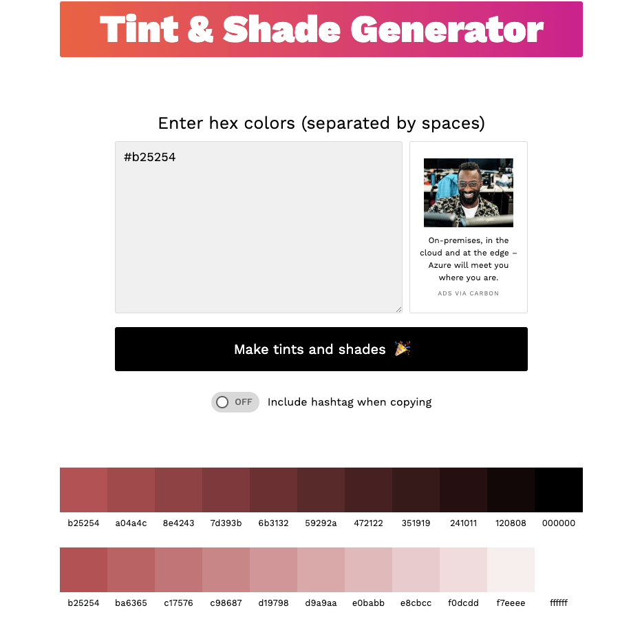
To find the perfect secondary colours, you could head to a website such as ColorSpace, which will do all the work for you to select other colours for your palette. I’m of the opinion though that simplicity is the best policy. In reality, rather than finding brand new colours to add to your website, you’re much better off adding shades of your current colours. To do that, you can use a tool such as this one from Make Tints and Shades. Look how handy it is for generating tints and shades, without any effort! All you need to do (as with the ColorSpace tool) is add the hex code for your primary colour.
Always Include your Neutral Colours
You might be thinking, why do I now need neutral colours, as well as primary and secondary ones? I get that it can get a bit confusing, but this is really important. The purpose of a neutral colour in your website is to give your viewers space and time to digest and prioritise the information you have on your page, which is after all why you have put the information there in the first place.
Without neutral colours, which include white, grey and black, you won’t have enough contrast, to make your palette colours stand out. In addition, the body of your text becomes very heavy and off-putting for your viewers.
A good example of this use of neutral colours comes from the Spotify website branding guidelines. Take a look at the image below.
Spotify explains that the one on the left is their primary logo and they provide clear instructions to use the black logo on light-coloured backgrounds, with the white logo one dark-coloured backgrounds. The use of neutral colours provides amazing contrast with the primary green colour, making it stand out and memorable.
If you’re still not sure about the neutral colours you should select with your primary colours, or you’re just looking for some inspiration, then head over to Designspiration, where you can use their colour search function for some great ideas on how to blend your neutral and primary colours.
Where Should the Primary, Secondary and Neutral Colours be Added?
This is of course a key question. It’s all very well and good saying that we need to include these types of colours but if we don’t know where to include them, then we’re no better off. Here are some suggestions as to where you should put each type of colour.
Primary Colours
These should be used in the areas of your website where users are most likely to either visit first or navigate to. These bolder, more striking colours will help to grab the viewers’ attention, prompting them to interact with your website. Examples of these areas include title banners, buttons, headlines, icons, downloadable content and any other important information that needs highlighting.
Secondary Colours
These colours are there to highlight supporting and other less important information on your website. Therefore, you might want to use them in areas such as subheadings, backgrounds, secondary buttons and supporting content, which could include FAQs and testimonials.
Neutral Colours
More often than not, you should use your neutral colours, which include white and black, for the text on your website, as well as page backgrounds. However, you can also use them quite cleverly in sections of your website which already have lots of colour, to break up the colour and draw a user’s attention to the most important information.
Take your Colour Selections for a Test Drive
Let’s assume you’ve arrived at the colour scheme (including primary, secondary and neutral colours) that you’re planning on using on your website. How do you know it is going to look good when you put it together on your website? What about in print, or in possible future merchandise? You choose a colour scheme to look great and attract the right visitors, so you want to make sure it works exactly as intended.
Therefore, it’s best to test your palette out on a mockup of your website, or something similar, first. If, once you have done that, you love what you see, then that’s great. If you’re not happy, you’ve now got the opportunity to go and change things around, before you take your website live. First impressions count, so you want to make sure your website is perfect when it is launched.
How will Digital Lychee Help You?
For all my clients, I want to make sure you love the website I build for you. Therefore, during the initial no-obligation consultation, we’ll discuss any design and branding requirements you might have, especially if you have a pre-existing logo you want to use.
From there, we will put together a suitable colour palette, before testing it out on a private version of the website, before it goes live. If you love it at that stage, that’s perfect. If not, I will make the necessary changes to ensure you love the end product. Get in touch now for your free initial consultation and to start your digital journey.