Have you ever uploaded a beautifully designed logo to your website, which appears to have the right dimensions for where it is going, only to find that it appears slightly blurry when compared to the original file? Well, you’re not alone. It’s something that happens fairly often and the reason is a lot simpler than you might think. In previous blogs, we looked at how we can correct the issue by both carefully selecting the logo image dimensions, and by replacing the standard PNG logo with an SVG version.
In this instalment, the final in the mini-series, we will see how we can solve this issue using a different method – installing a plugin on your website, to display a different version of the logo depending on the resolution of the device on which your website is being viewed. From your point of view, this is perhaps the least work-intensive of the three methods, so it could be a winner. It is worth noting, however, that this method works only for WordPress websites as it stands, due to the wealth of plugins available on the platform.
Before we go into detail about this method, let’s remind ourselves how big a logo should typically be, and why it will often end up blurry, even when you have uploaded an image with the right dimensions.
What are the Typical Dimensions of a Website Logo?
On any website, be it WordPress, Squarespace, an HTML website or any other website type, there will be an ideal size for your logo, to prevent it from being both too small that it becomes insignificant and too large that it becomes overpowering. Typically, these are the pixel dimensions you want to aim for:
- 250px (width) x 100px (height) for a rectangular logo
- 160px (width) x 160px (height) for a square logo
Now, your logo can of course vary slightly from these but proportionally, they are what you should be aiming for. For my own logo, it has dimensions of 239px wide by 50px high.
Why is my Logo Blurry, even with the Right Dimensions?
The issue of blurriness arises when you upload an image that has the exact pixel dimensions of the space you are targeting. The exact reason has to do with the resolution of modern screens.
No matter what device you are using, your screen is essentially made up of lots of tiny pixels, which display various colours, making up the image you see. More modern devices tend to have a much higher resolution than older ones. By that, I mean that for the same viewing window size, the screen is made up of many more, smaller pixels compared to that of an older device, resulting in a sharper display.
If we take Apple as an example, they have coined the phrase ‘Retina’ to refer to their higher resolution screens. Picking a specific example, their iPhone 3GS has a non-Retina standard display, with a pixel density of 164.83 pixels per square inch. Their iPhones 4 and 4S both have a Retina display, where that pixel density figure increases to 326, almost double that of the older model. You can see what I’m talking about with the images below. For the same physical dimensions, the Retina display of the iPhone 4 is much sharper than that of the iPhone 3GS.


Now, I hear you asking, ‘but what does this have to do with my logo being blurry?’. When you upload a logo that has the exact dimensions of the space into which you are placing it, you’ve specified the physical dimensions at which it should be displayed, as well as providing a file with those exact stated pixel dimensions.
The problem is, on a Retina display, the pixels are much smaller. In our example above, that’s approximately 2x smaller. So, taking my logo as an example, for the same physical size, where a standard screen would have 239px by 50px, a Retina screen would have 478px by 100px. If you’re uploading an image that is only 239px by 50px, into an area that is 478px by 100px, the logo image dimensions will be stretched 2x, to fill the specified space, resulting in it becoming blurry. You’ve essentially uploaded a logo that displays fine on standard definition screens, but that will appear blurry on high resolution screens.
How do I Make Sure my Logo is not Blurry, on all Screens?
With most website builders, including WordPress, you are only able to upload one image file for your logo, without a second option for higher resolution screens. That leaves you vulnerable to a blurry logo, which I’m sure you won’t want, especially when trying to impress new clients or visitors to your website.
There are three main ways you can prevent this from happening, whilst most web design platforms aren’t able to provide direct support for both standard and high-resolution screens. These are:
- Uploading a version of your logo that has 2x the required pixel dimensions.
- Uploading an SVG version of your image, instead of the typical PNG format.
- Installing additional plugins, or software, to provide this functionality.
Each of these methods has its pros and cons, as with anything. In this, the final instalment in this mini-series, we’ll look at the third method, which involves installing a plugin on your website, step by step, to see how we can achieve a sharp-looking logo on all screens.
#1: Install the Plugin
There are a number of different plugins that you could use to achieve a great looking logo (and other images of course) on your WordPress website. In this tutorial, I am going to focus on one in particular – Perfect Images + Retina by Jordy Meow. This is a 5* rated plugin that really takes the stress out of making images look great on your website, not only with logos, but also with all other images. To install the plugin, as with any other plugin on your WordPress website, head to:
Dashboard > Plugins > Add New
Once there, search for something like ‘2x Retina’ or ‘Perfect Images + Retina’. Once you’ve found the plugin, you just need to click ‘Install’, ‘Activate’ and then you are good to go.
#2: Upload a Full-size Version of your Logo (and Other Images)
For this plugin to work correctly, you need to make sure that you have a full-size version of your logo, or any other image you are uploading, as it can shrink all images to the right sizes, from the original large version, but it cannot increase the size of the image, from a small or low-quality original.
In the first tutorial in this mini-series, we saw how a retina image is essentially 2x the pixel dimensions of a standard image. Therefore, when I mention uploading a full-size version of your logo, the very least it should be is 2x the size it will take on your website. With my own website, the logo has dimensions of 239px x 50px. Therefore, I would need to upload a logo image that has dimensions of at least 478px x 100px. Ideally, the image I upload, to work with this plugin, should be larger still than that. The same goes for you and your website. For this plugin to work effectively, all the images you upload should have dimensions of at least 2x the space in which you want them to feature. That goes for your logo image as well as content images. To upload your logo, simple head to:
Dashboard > Media > Add New
Then, either browse for your image on your computer, or drag and drop it into the media area. Then, voilà! Your image is uploaded to your website.
#3: Generate the Retina Images
At this point, we have installed the plugin on our websites, and we have uploaded the correct size of image. The next thing we need to do is very simple – generate the retina images.
There’s a good reason why I think this is the simplest, least technical method available for sharpening your logo on your website. All you need to do, with the images uploaded to your media folder, is head to the plugin-specific dashboard, which you will find in the menu on the left-hand side of your WordPress dashboard. Once there, click on ‘Bulk Generate’.
That’s all there is to it. Your retina images will be automatically generated. The plugin is clever-enough to detect the type of display on which your website is being viewed, so that it can display the correct resolution of image, ensuring your logo and other images always look sharp on your website.
It’s worth noting that this is not an image optimisation plugin. By this, I mean that it does not optimise the images for faster page loading speeds etc. It only ensures they always display sharply on your website. You will have to look elsewhere if you want to optimise your images in that respect. A few plugins you could look at are LiteSpeed Cache, Autoptimize, and finally WP Rocket, although this final one is premium-only, so you will have to pay to use it.
The Perfect Result of our Logo Styling
That’s all there is to it! Once you have uploaded the full-sized version of your logo to your WordPress website, and you have generated the retina image, you’re good to go! The same goes for your website content images. At this point, you can be safe in the knowledge that your images will always display sharply on your website. Just remember, if you upload new images to your website after your initial ‘Bulk Generate’, you need to hit that button again, as the plugin won’t automatically create the retina versions for the new images.
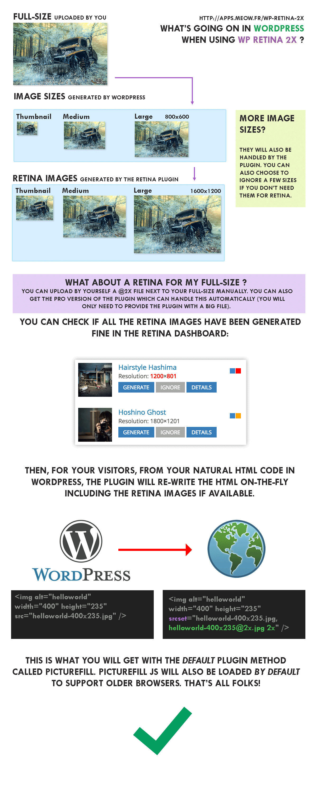
For a quick summary of how this plugin is sharpening the images on your website, take a look at this infographic, which is taken directly from the plugin website.

How will Digital Lychee Help You?
At Digital Lychee, I make sure that I tailor all my clients’ websites to suit their individual needs. In your initial consultation (free and no obligation, of course) we will discuss your needs in full and I can advise you on how best to create your logo (and other images) to make sure they are as sharp as possible on all possible devices. If you are interested in my services, or you want to find out more about my blog, I would love to hear from you. You can get in touch with me here.
