Have you ever uploaded a beautifully designed logo to your website, which appears to have the right dimensions for where it is going, only to find that it appears slightly blurry when compared to the original file? Well, you’re not alone. It’s something that happens fairly often and the reason is a lot simpler than you might think. In a previous blog, we looked at how we can correct the issue by carefully selecting the dimensions of the image file we upload. In this instalment, we will see how we can solve the issue, using a different method – replacing the typical logo PNG image file with an SVG file. First, let’s remind ourselves how big a logo should typically be and why it will often end up blurry, even when you have uploaded an image with the right dimensions.
What are the Typical dimensions of a Website Logo?
On any website, be it WordPress, Squarespace, an HTML website or any other website type, there will be an ideal size for your logo, to prevent it from being both too small that it becomes insignificant and too large that it becomes overpowering. Typically, these are the pixel dimensions you want to aim for:
- 250px (width) x 100px (height) for a rectangular logo
- 160px (width) x 160px (height) for a square logo
Now, your logo can of course vary slightly from these but proportionally, they are what you should be aiming for. For my own logo, it has dimensions of 239px wide by 50px high.
Why is my Logo Blurry, even with the Right Dimensions?
The issue of blurriness arises when you upload an image that has the exact pixel dimensions of the space you are targeting. The exact reason has to do with the resolution of modern screens.
No matter what device you are using, your screen is essentially made up of lots of tiny pixels, which display various colours, making up the image you see. More modern devices tend to have a much higher resolution than older ones. By that, I mean that for the same viewing window size, the screen is made up of many more, smaller pixels compared to that of an older device, resulting in a sharper display.
If we take Apple as an example, they have coined the phrase ‘Retina’ to refer to their higher resolution screens. Picking a specific example, their iPhone 3GS has a non-Retina standard display, with a pixel density of 164.83 pixels per square inch. Their iPhones 4 and 4S both have a Retina display, where that pixel density figure increases to 326, almost double that of the older model. You can see what I’m talking about with the images below. For the same physical dimensions, the Retina display of the iPhone 4 is much sharper than that of the iPhone 3GS.


Now, I hear you asking, ‘but what does this have to do with my logo being blurry?’. When you upload a logo that has the exact dimensions of the space into which you are placing it, you’ve specified the physical dimensions at which it should be displayed, as well as providing a file with those exact stated pixel dimensions.
The problem is, on a Retina display, the pixels are much smaller. In our example above, that’s approximately 2x smaller. So, taking my logo as an example, for the same physical size, where a standard screen would have 239px by 50px, a Retina screen would have 478px by 100px. If you’re uploading an image that is only 239px by 50px, into an area that is 478px by 100px, the logo image dimensions will be stretched 2x, to fill the specified space, resulting in it becoming blurry. You’ve essentially uploaded a logo that displays fine on standard definition screens, but that will appear blurry on high resolution screens.
How do I Make Sure my Logo is not Blurry, on all Screens?
With most website builders, including WordPress, you are only able to upload one image file for your logo, without a second option for higher resolution screens. That leaves you vulnerable to a blurry logo, which I’m sure you won’t want, especially when trying to impress new clients or visitors to your website.
There are three main ways you can prevent this from happening, whilst most web design platforms aren’t able to provide direct support for both standard and high-resolution screens. These are:
- Uploading a version of your logo that has 2x the required pixel dimensions.
- Uploading an SVG version of your image, instead of the typical PNG format.
- Installing additional plugins, or software, to provide this functionality.
Each of these methods has its pros and cons, as with anything. In this instalment, we’ll look at the second method, uploading an SVG file, step by step, to see how we can achieve a sharp-looking logo on all screens.
#1: Create an SVG Version of your Logo
An SVG file, or Scalable Vector Graphics file, is a vector image format. Unlike standard image formats, like JPG or PNG, its dimensions are not defined by a set number of pixels. It can be scaled up and down without affecting quality.
Whilst you therefore do not need to worry about creating a specific size of the file initially, you need to make sure you are able to generate the SVG file itself, which is more specialised than other formats. If a designer created your logo, get in touch with them to ask them to create the SVG format. If you used your own software, or an online logo generator, simply export the logo as an SVG logo.
Something to be aware of with an SVG version of your logo is that if you have used custom fonts, these can struggle to be displayed properly, since they are not web safe. A web safe font is one that is standard in website design and can be displayed across all browsers on all devices by default. You’ll want to correct this, as the fonts you choose for your logo are often key to your branding.
To ensure that you don’t have any issues with fonts in your logo, there are a few different things you can do. CSS Tricks takes you through all the different possible options, but most strongly recommends font embedding, whilst also giving you a detailed explanation of how it works and what you can do to improve your SVG logo in this way. If you need any support in doing that for your logo, then please don’t hesitate to get in touch.
#2: Specify the Dimensions of the SVG as you Want it to Appear on your Site
With the previous method, we wanted to make sure that we upload an image file whose dimensions are exactly twice the size of the space in which it is going. With this method, we don’t need to worry about that. The reason why this step becomes necessary is because by default, the width and height of the exported SVG will be set as ‘100%’. The problem with that is your browser may struggle to display the SVG logo properly, without scaling, since it will try to be as large as possible, struggling to fit in an area as small as your logo. That’s why I would always recommend specifying the width and height in terms of pixels.
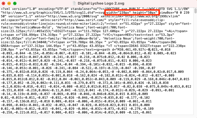
To do this, you simply need to open your SVG file with a basic text editor, such as Notepad, Notepad ++ or TextEdit on a Mac. When you do that, you’ll be greeted by something that looks like this.

Don’t worry if this looks quite daunting. If you remember, I mentioned that and SVG file is essentially a vector image format, which means that instead of being stored as lots of small, coloured pixels, the file contains the necessary information to define the curves, colours, and fonts etc to display the image on the screen. That’s what all the information you’re seeing means and that’s how it can look great at any zoom level.
The only bit of it here that you need to concern yourself with is the section in red. That’s what defines the size of the image within the file. These were initially set to ‘100%’, which means the image will take up the full width of the document, no matter how much it is zoomed in. You’ll see that I changed them to the size of the space I wanted the logo to take up on my website, which is a width of 239px and a height of 50px. Now, you might want slightly different dimensions compared to the ones I picked, especially if your logo is squarer, but either way this is how you should specify the dimensions.
#3: Upload your SVG Logo Image (to a WordPress Website)
You would think this simple step would be the same as if you were uploading a normal image file. However, it sadly isn’t. WordPress doesn’t support SVG images by default, no matter what they’re being used for. You need to add that functionality. Don’t worry though. All you need to do is install and activate a plugin that allows your website to support SVGs. To do that, head to:
Dashboard > Plugins > Add New
Then, search for either SVG Support or WP SVG Images. Both plugins are highly rated and will allow you to upload SVG images. Once activated, you simply need to upload your SVG logo. Typically, with a WordPress website, you need to head to:
Dashboard > Appearance > Customise > Site Identity
Different themes may have subtle differences as to where you upload the logo image file, but it will always be available in the ‘Customise’ area of WordPress.
#4: Upload your SVG Logo Image (to a Squarespace Website)
As with a WordPress site, a Squarespace one won’t allow you to use an SVG logo by default. However, unlike with a WordPress site, you won’t need to install any additional software just to upload the file. If you’re unsure of exactly how to upload an image to your Squarespace website, check out this link, from their support pages.
When you have uploaded your image to the media area of your website, make a note of the URL the SVG file is given. Once you have done that, instead of heading to:
Design > Logo & Title
To use your SVG image as your website logo, you will need to add some custom CSS (Cascading Style Sheets) code. To do that, you need to head to:
Design > Custom CSS
This is where you are going to add the custom code, which will look like this:
It’s worth noting that if you’re wanting to display your logo in the top centre of the screen, it might currently be showing slightly off-centre with this code alone. To correct it, you just need to add this to the code above, before the curly ‘}’ bracket:
The other thing to remember here is that the class or ID used for the logo on your website, that sits before the curly brackets, may be different to that in the example above. To find out exactly what it is for your website, simply right clicking on the logo in your template and selecting ‘Inspect’ or ‘Inspect Element’.
The Perfect Result of our Logo Styling
That’s all there is to it! Once you have created the SVG version of your logo, you have uploaded it to your website and you have selected it as your logo, you should see a marked difference in its sharpness. You can apply the same logic to other images on your website.
Stay tuned for the next instalment, where I will take you through another method to sharpen images such as your logo, which relies on installing various plugins and additional pieces of software, to enable you to show a sharp, crisp logo image on all possible devices.
How will Digital Lychee Help You?
At Digital Lychee, I make sure that I tailor all my clients’ websites to suit their individual needs. In your initial consultation (free and no obligation, of course) we will discuss your needs in full and I can advise you on how best to create your logo (and other images) to make sure they are as sharp as possible on all possible devices. If you are interested in my services, or you want to find out more about my blog, I would love to hear from you. You can get in touch with me here.
On any website, be it WordPress, Squarespace, an HTML website or any other website type, there will be an ideal size for your logo, to prevent it from being both too small that it becomes insignificant and too large that it becomes overpowering. Typically, these are the pixel dimensions you want to aim for:
- 250px (width) x 100px (height) for a rectangular logo
- 160px (width) x 160px (height) for a square logo
Now, your logo can of course vary slightly from these but proportionally, they are what you should be aiming for. For my own logo, it has dimensions of 239px wide by 50px high.
